Undergraduate
I graduated Cum Laude with a Bachelor of Science degree in Design from Biola University.The Fine Art and Design courses I took during my time at Biola each served as foundational lessons in the way I design for every project. Some notable courses were Illustration, several iterations of Typography, Integrated Design, and Graphic Design Forms.
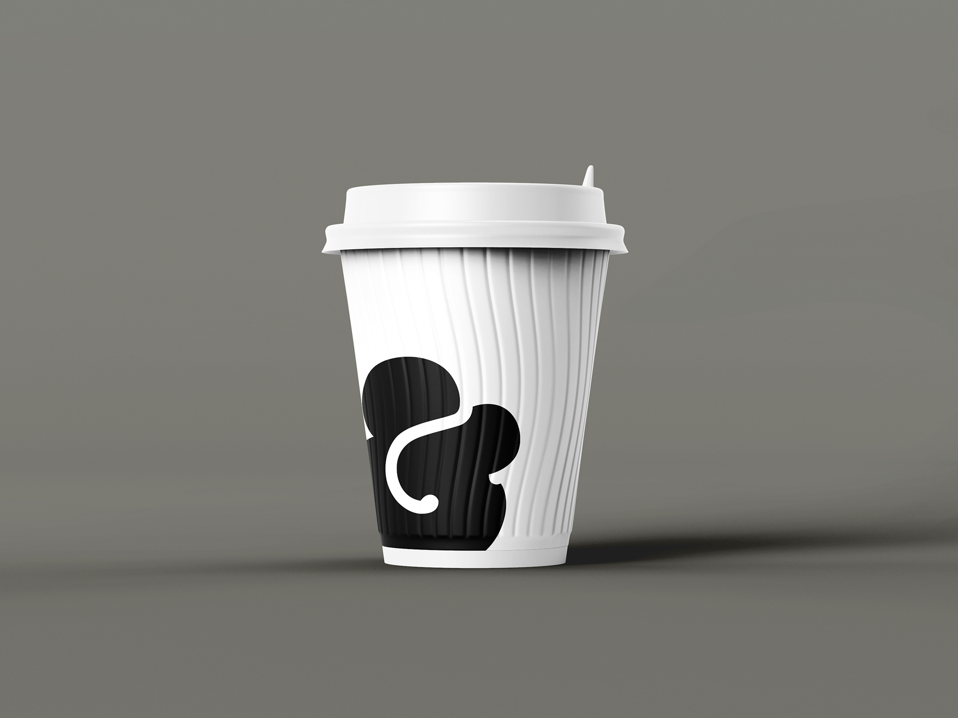
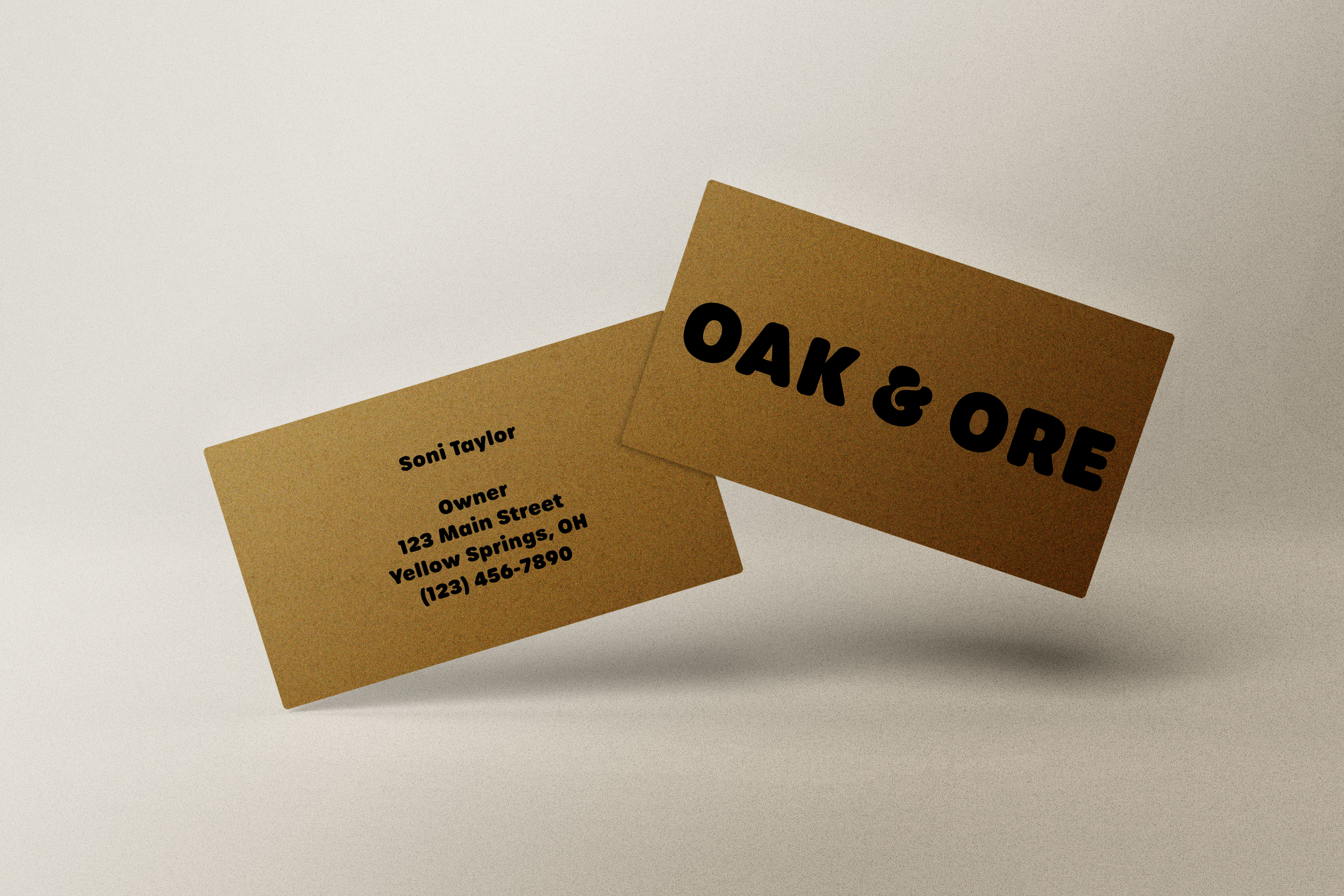
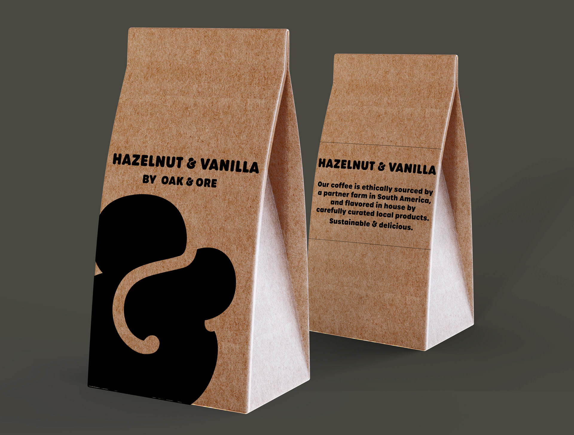
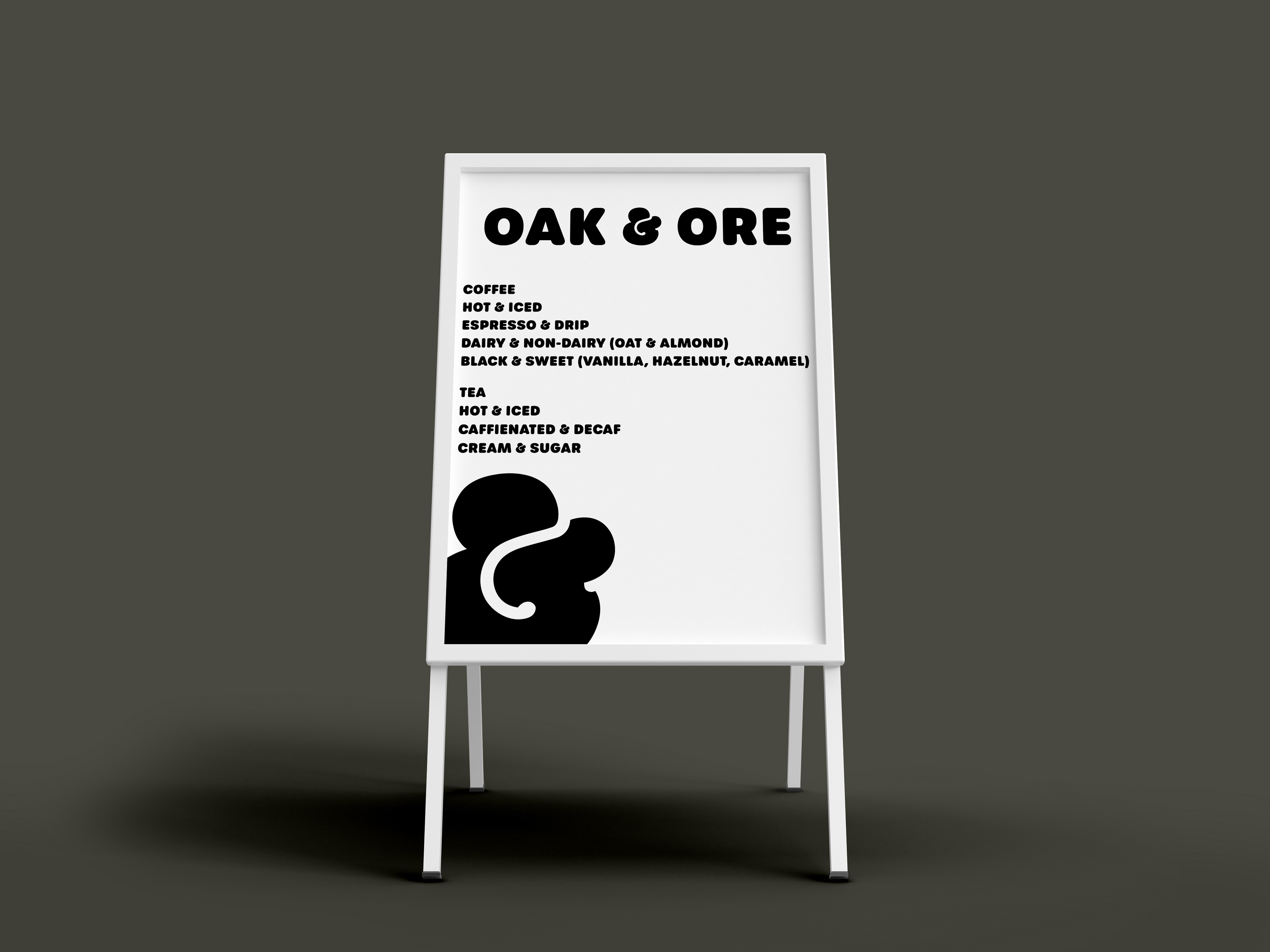
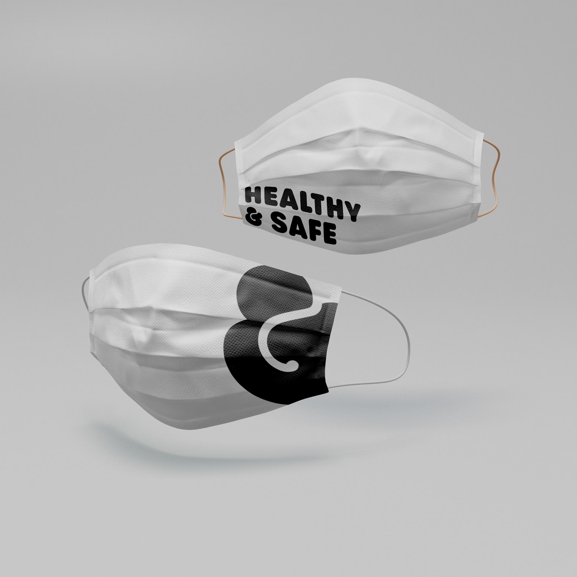
Coffee Shop Identity Project: For this project I was given a brief from a fictional client (a classmate) to create an identity for a coffee shop in Yellow Springs, OH. I was responsible for research and identification of the demographic and needs of the location, followed by weeks of concept work. I finished the project with a thorough understanding of the real needs of the town of Yellow Springs, OH (not fictional), and a well developed experience of a branding project from concept to production.
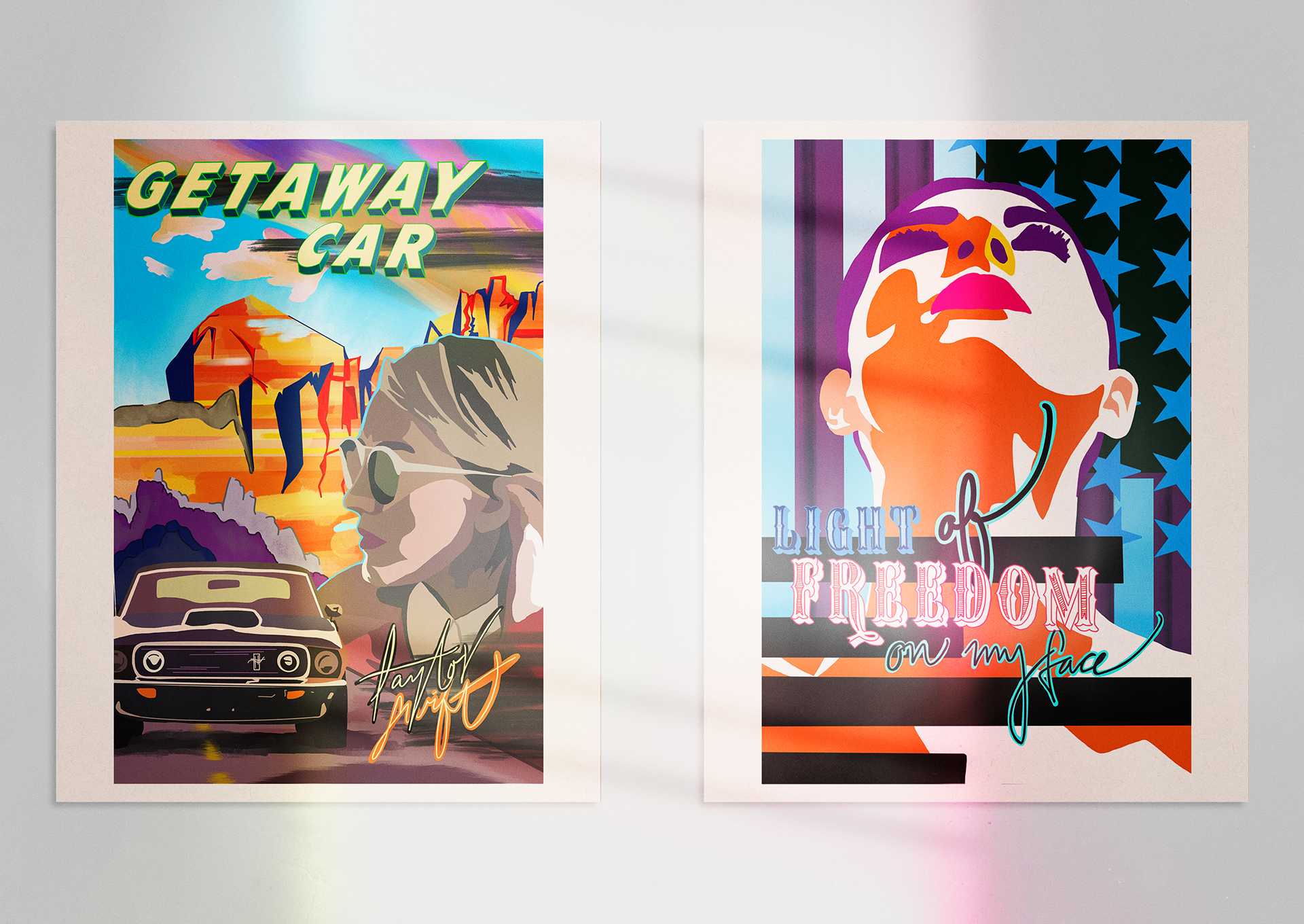
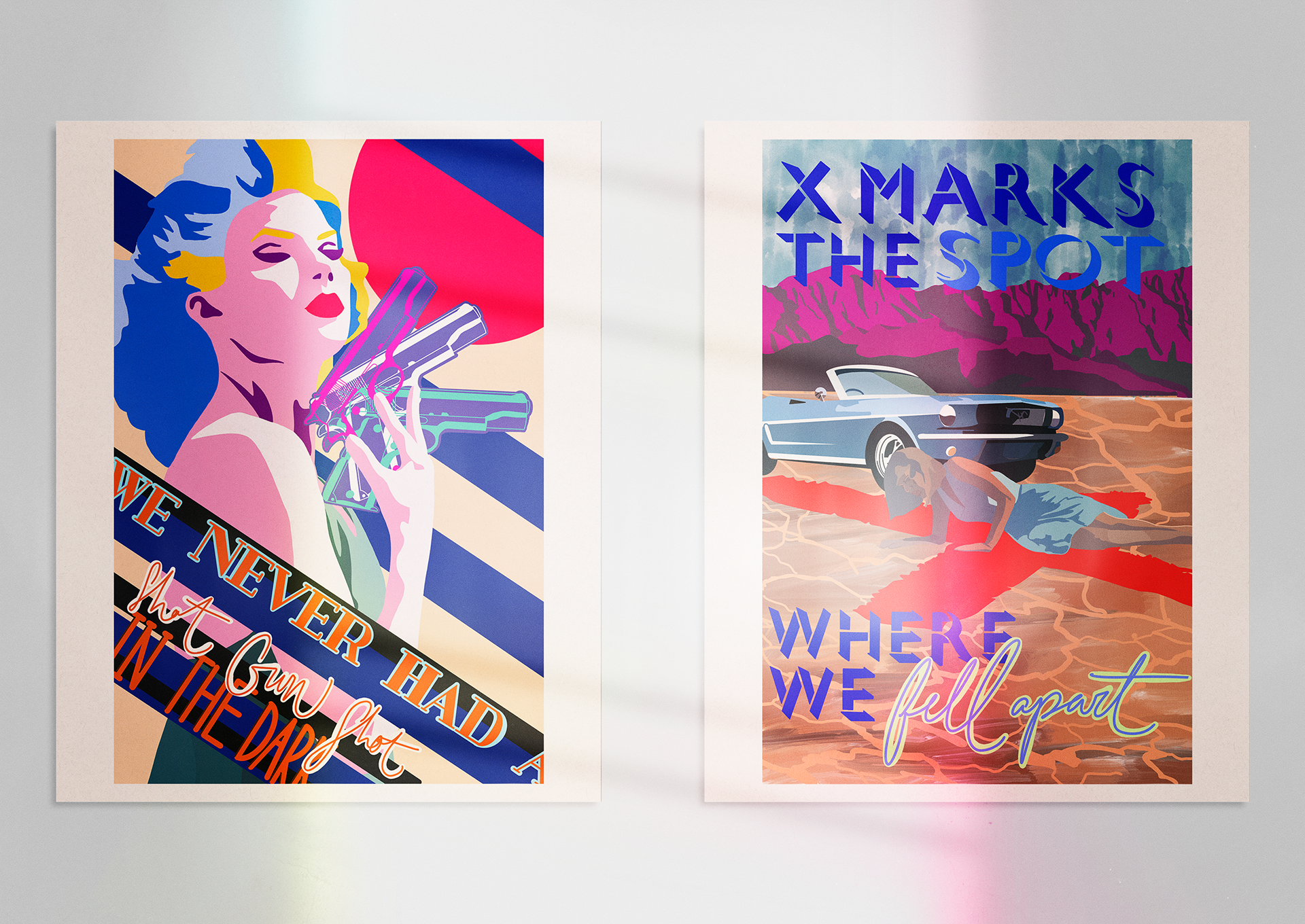
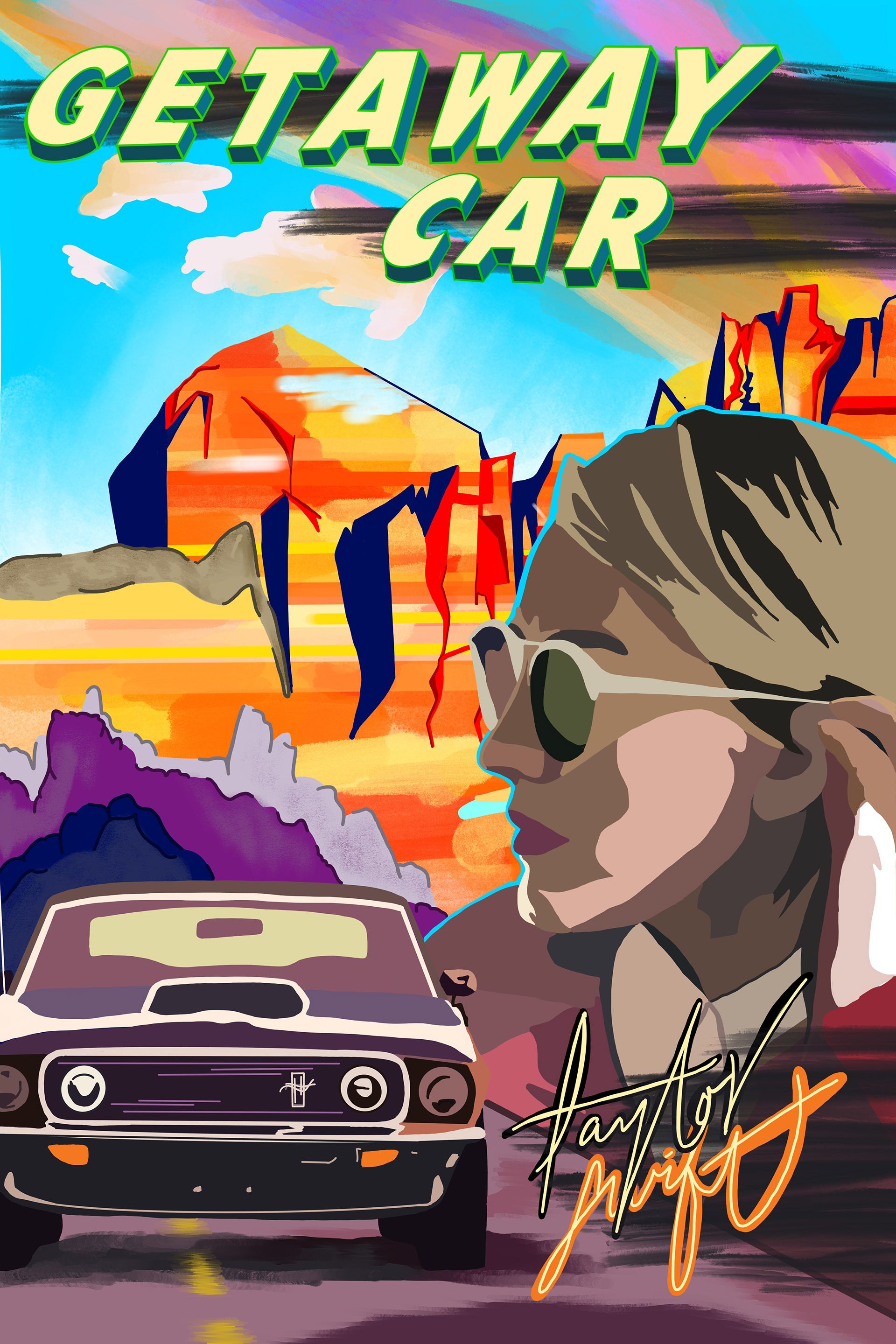
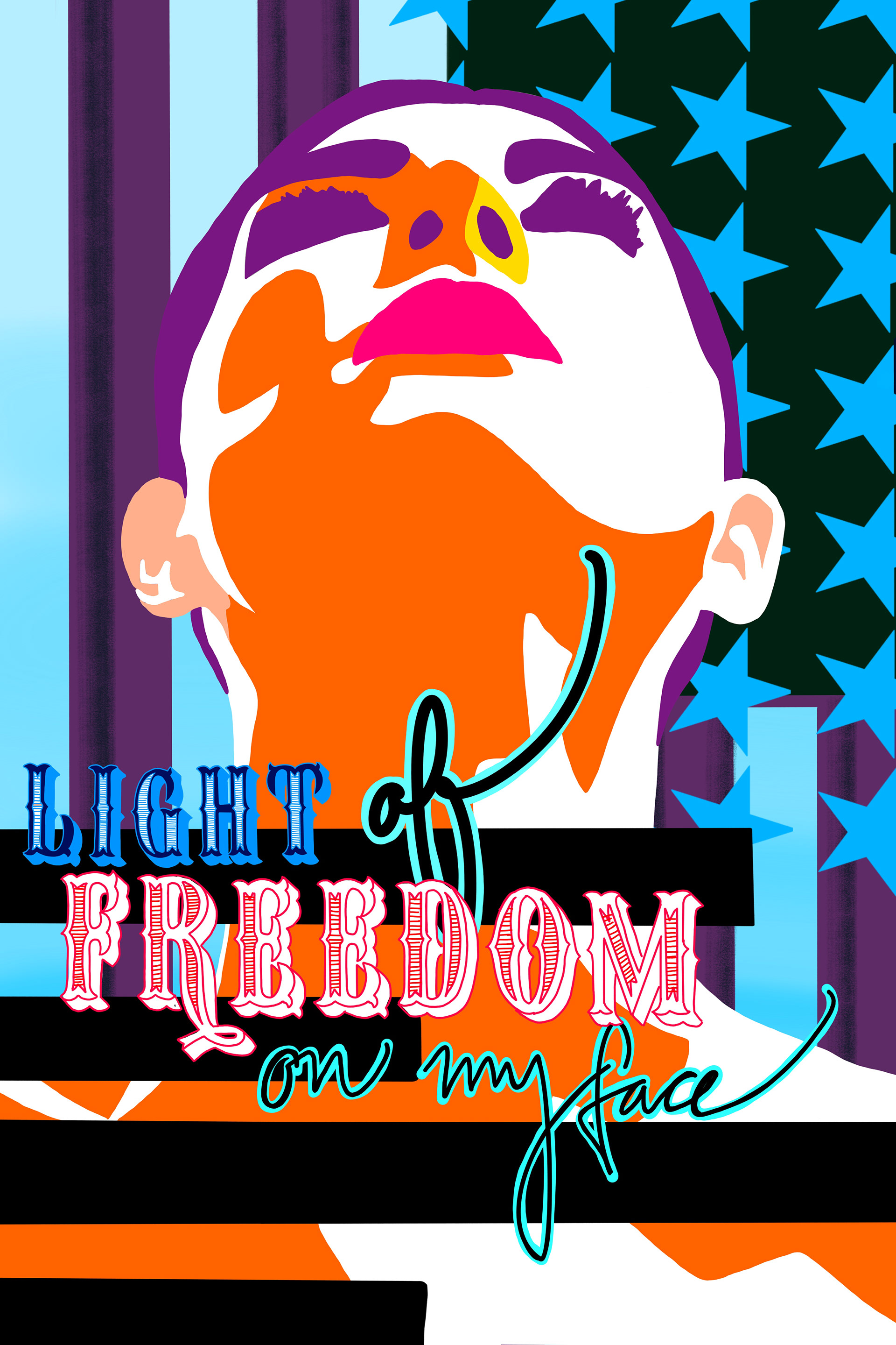
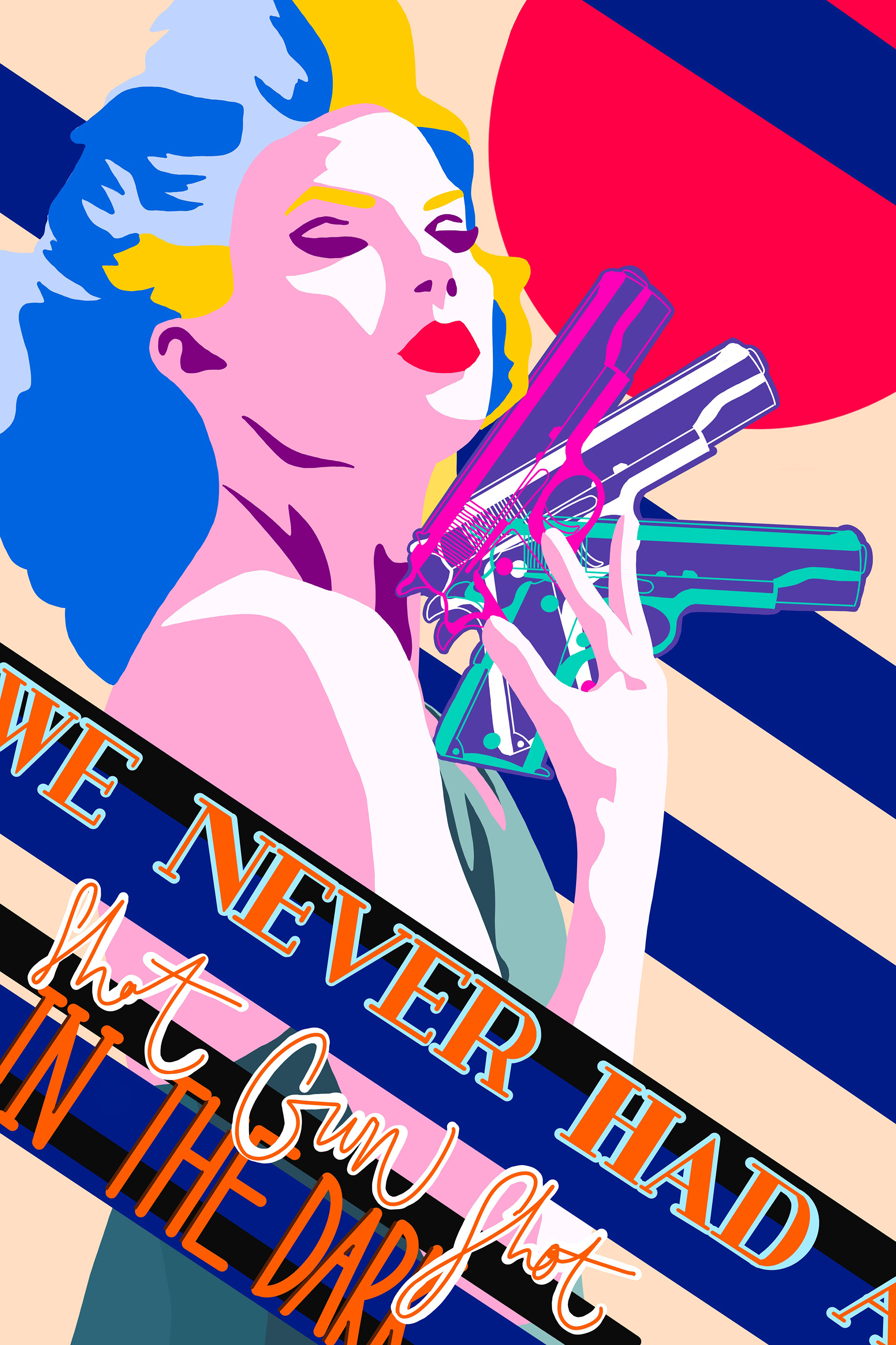
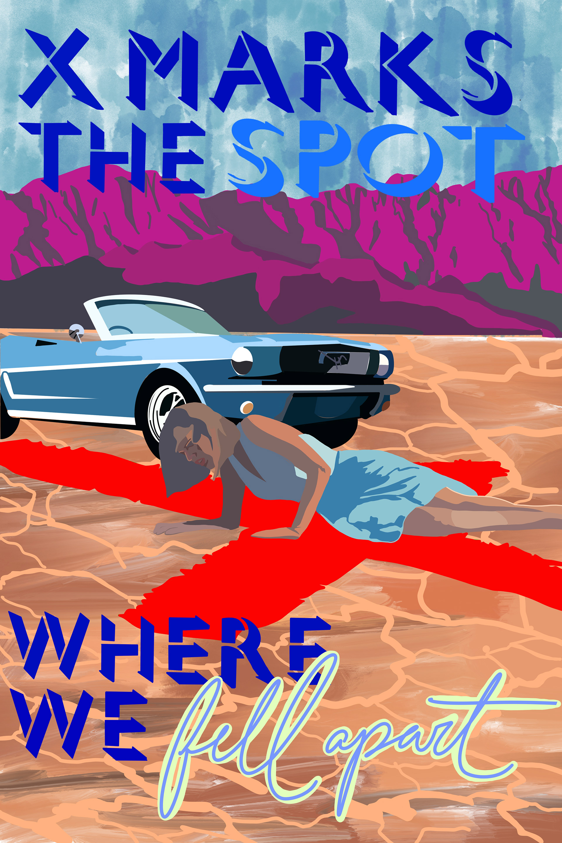
Movie Poster Series: In this project I was tasked with creating an advertisement style movie poster series from a mainstream song (Getaway Car by Taylor Swift). This was my first experience translating one art medium (song) to another art medium (poster series). I drew everything by hand (including typography) in both Procreate and a variety of fine art mediums (acrylic, sharpie, etc.). This was the first time I created a series of different pieces while maintaining one visual identity throughout. It also provided the foundation for my understanding of the nuances of consistency in perspective, scale, and exposed me to the processes of formal illustration vs. graphic design for advertisement and marketing purposes.
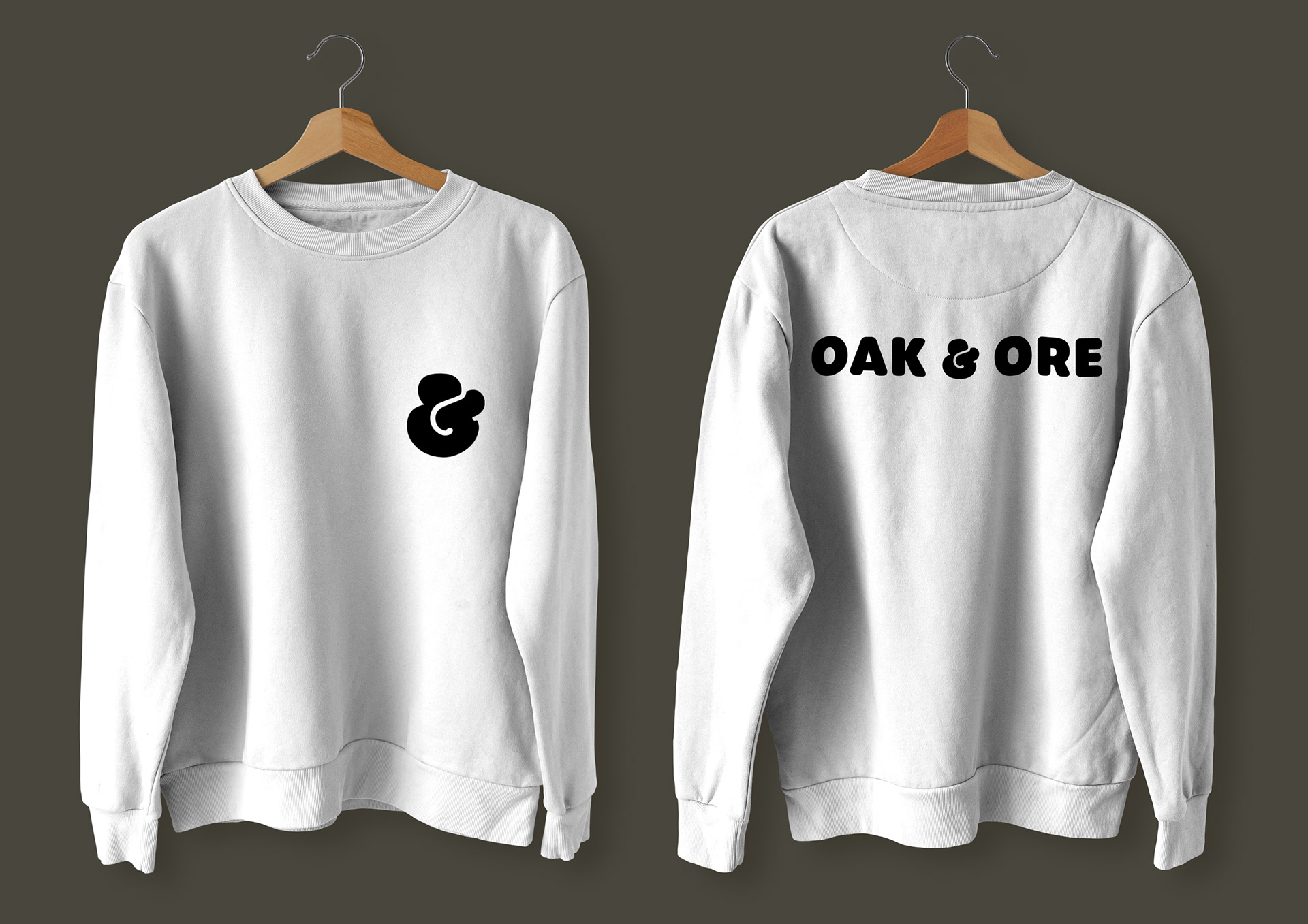
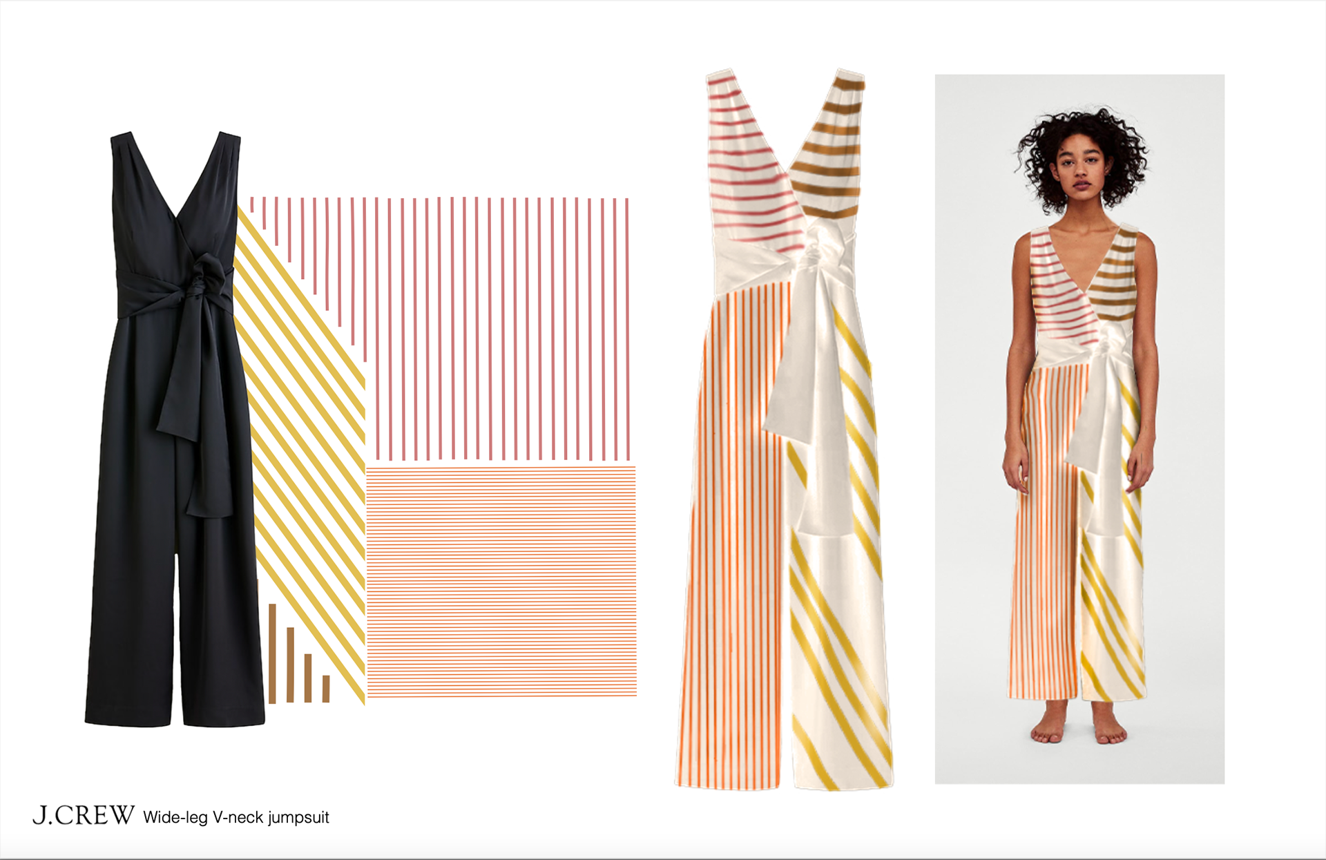
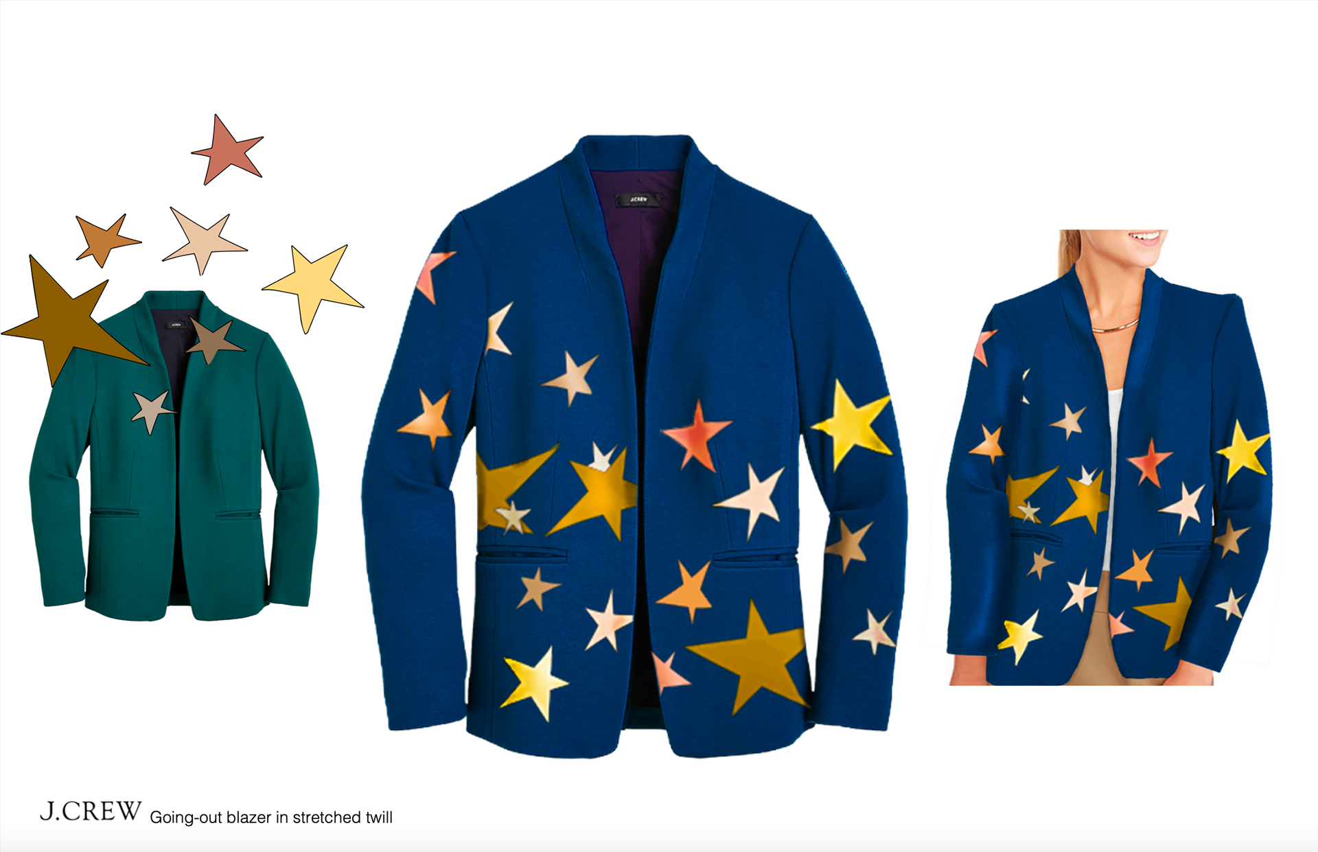
Softgoods Study: I started with two exisitng items (both from J. Crew) and edited them to match the visual identities the 1970's. After research and development, I mocked my patterns up on the existing made items to create something new. This was my first experience doing a mock up on my own, and in doing so I got incredibly comfortable at creating my own mockups and identifying shadows, lighting, and fabric nuances rather than relying on mockup templates to communicate what I want.
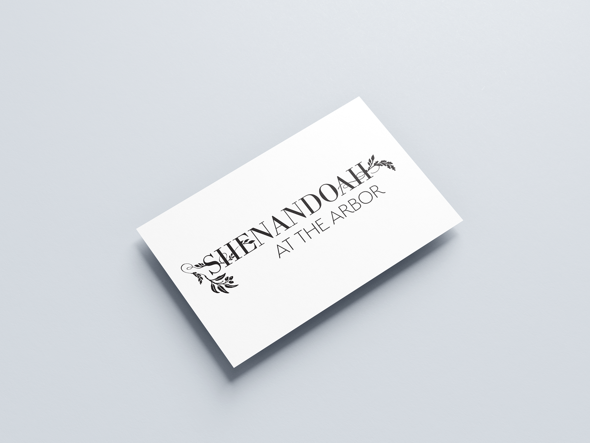
Logo Redesign: For this project each student was tasked with redesigning the logo of a chosen local business. I chose a restaurant called Shenandoah at the Arbor, located in Long Beach, CA. Through an extensive research and development process, I felt the final deliverable stayed true to the atmosphere of the restaurant and preserved visual cues from the old logo (see below) but in a refreshed way.
Original Logo
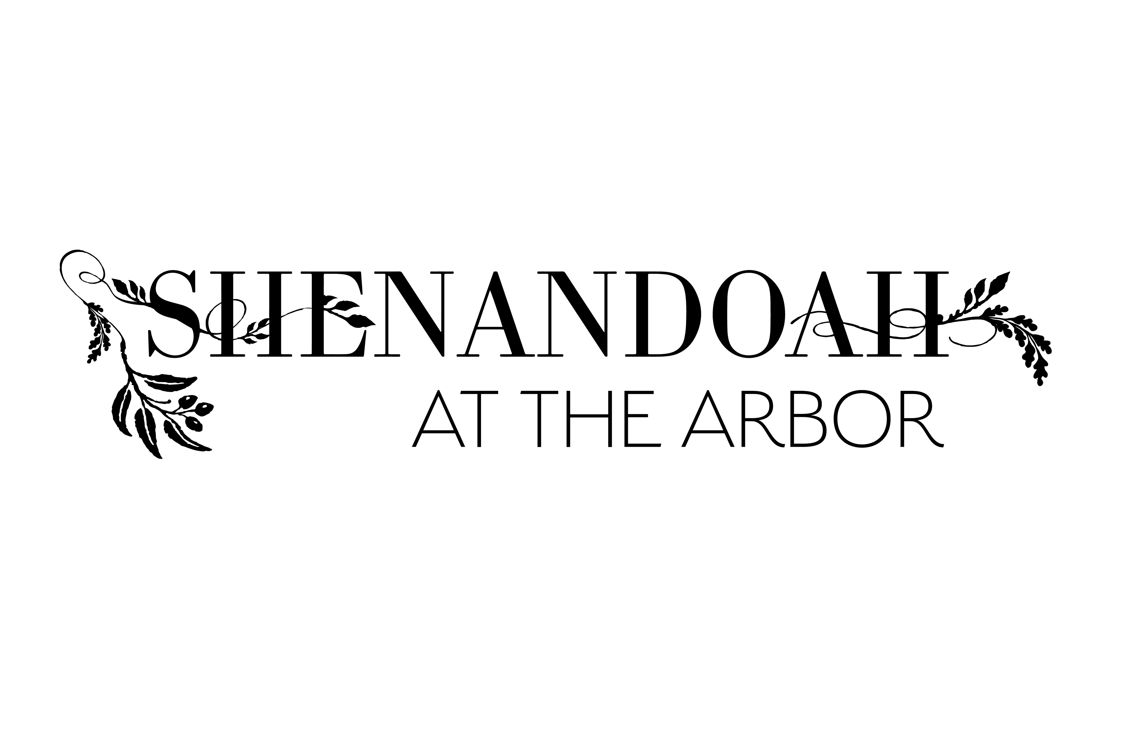
Redesigned Logo
"The Big One" Podcast Illustration: I was tasked with creating an exclusively hand illustrated icon to serve as representation for KPCC's (Southern California Public Radio) podcast titled "The Big One: Your Survival Guide", a podcast about the potential repercussions of the impending earthquake in and around Los Angeles' portion of the San Andreas Fault.
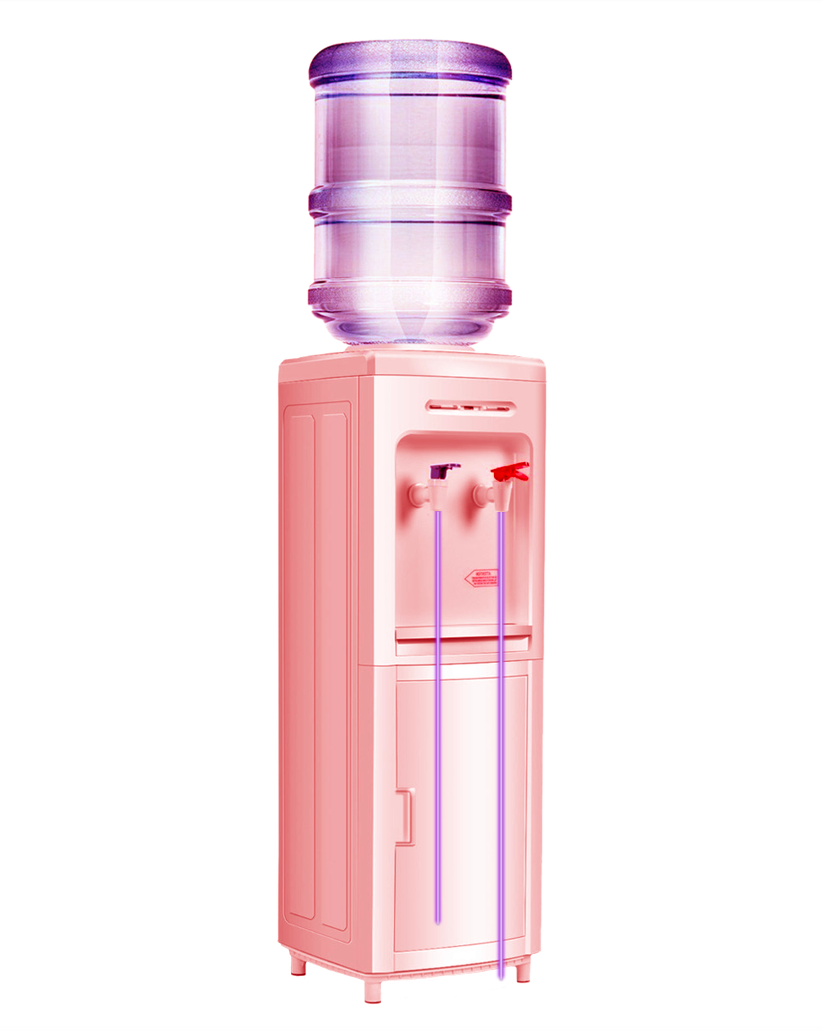
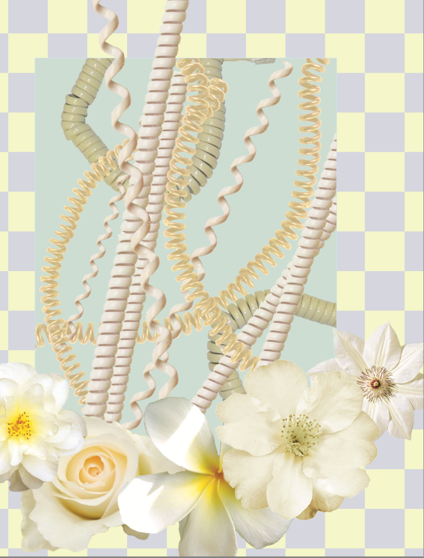
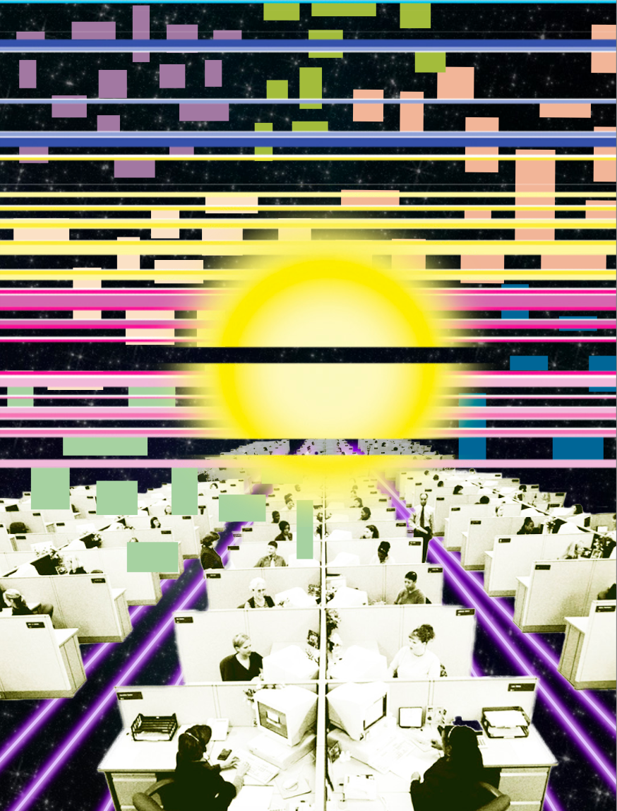
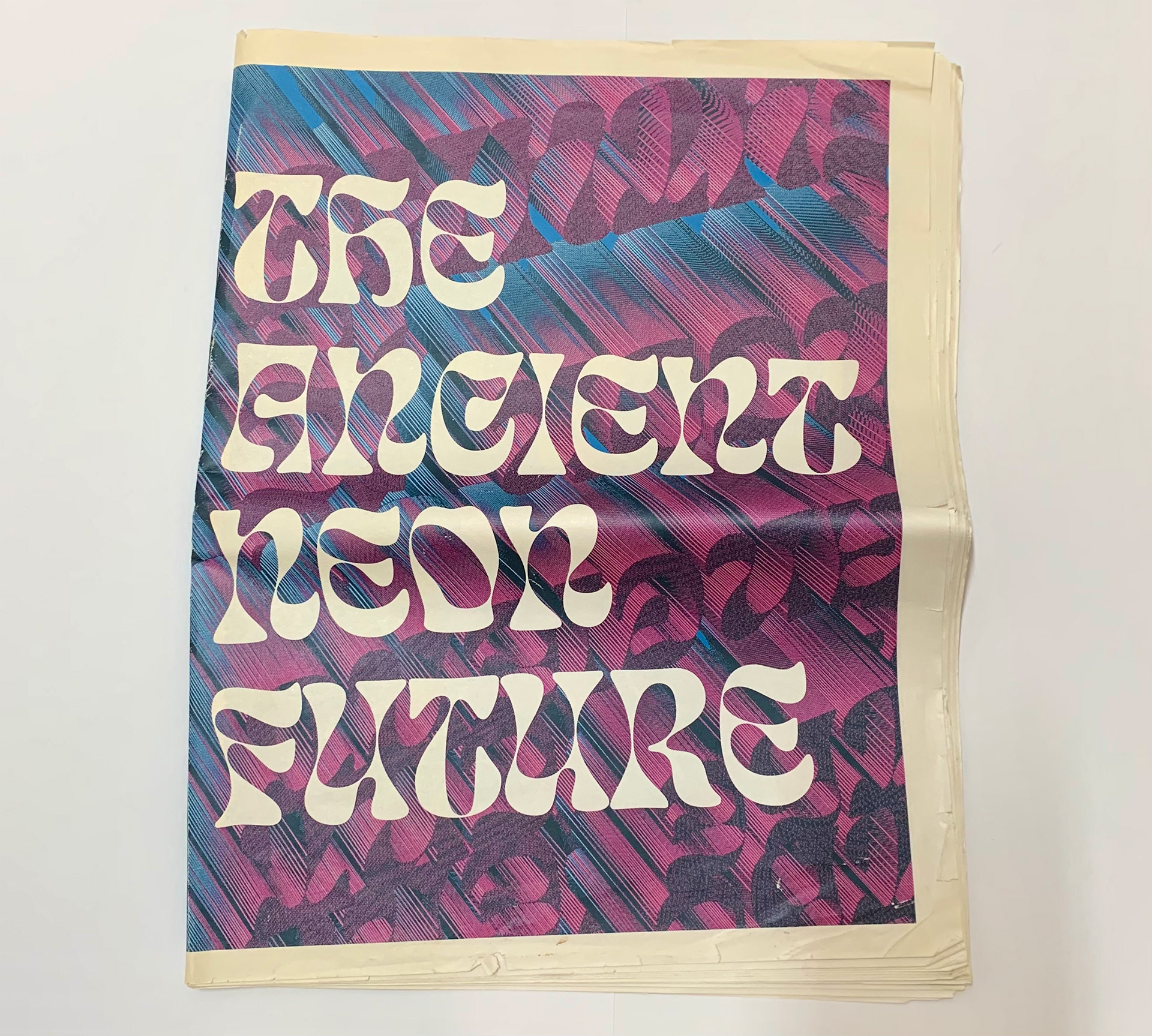
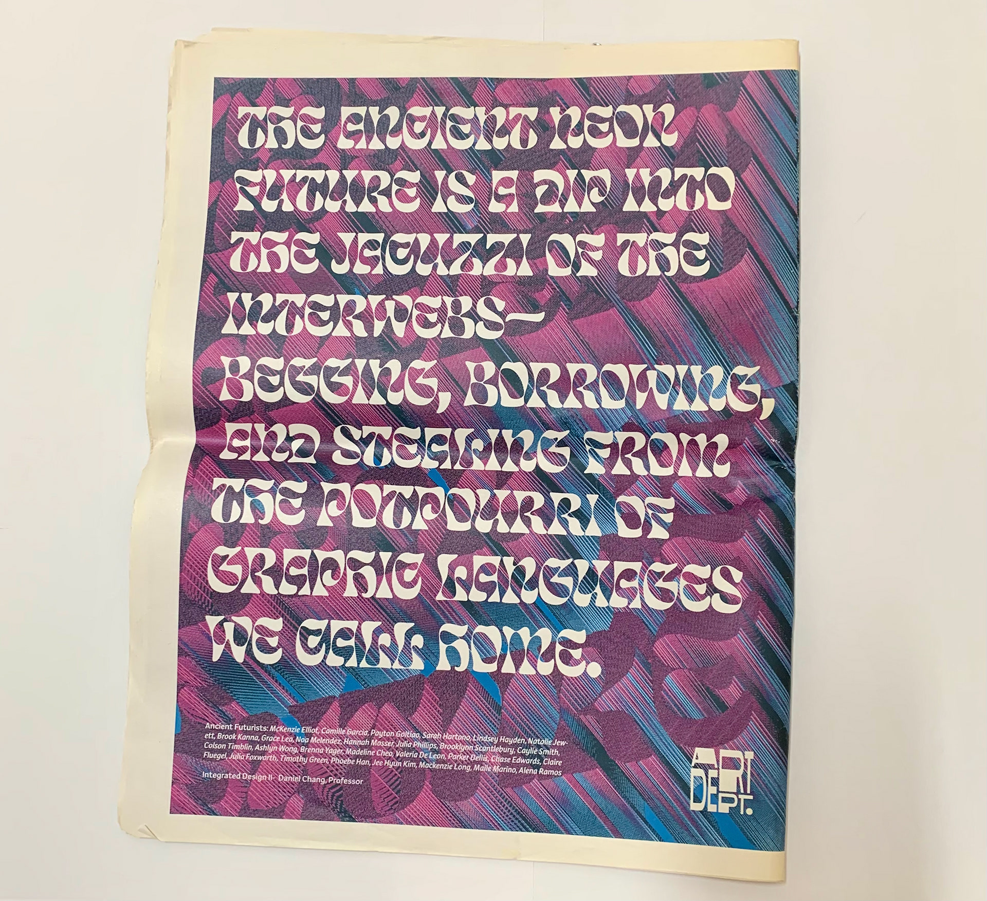
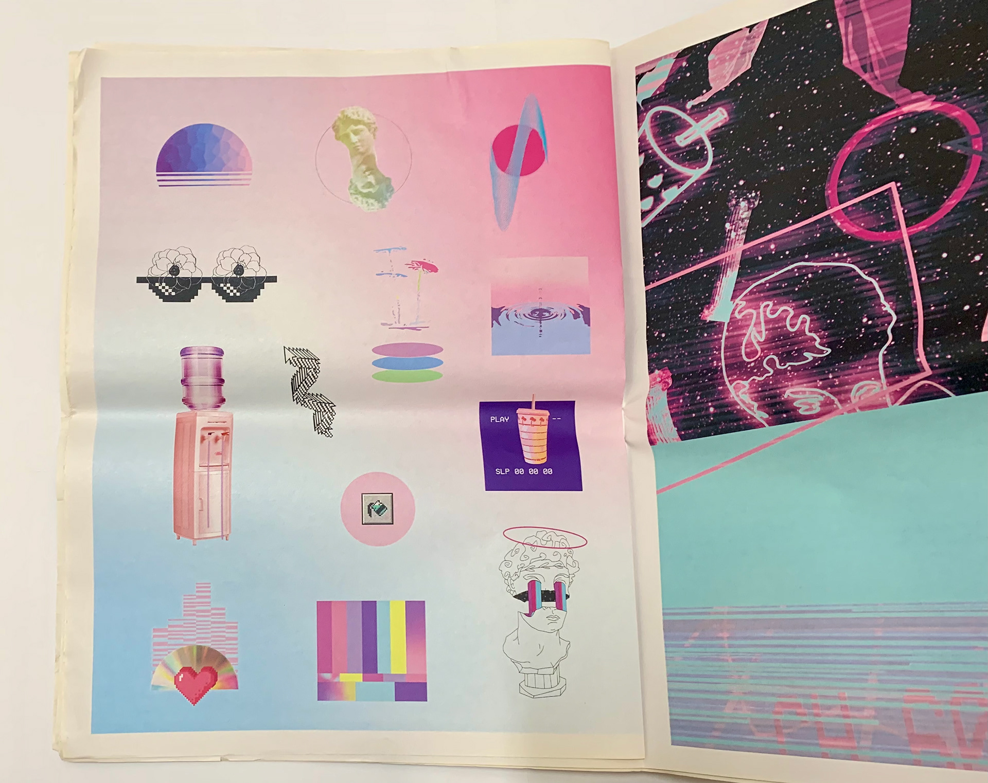
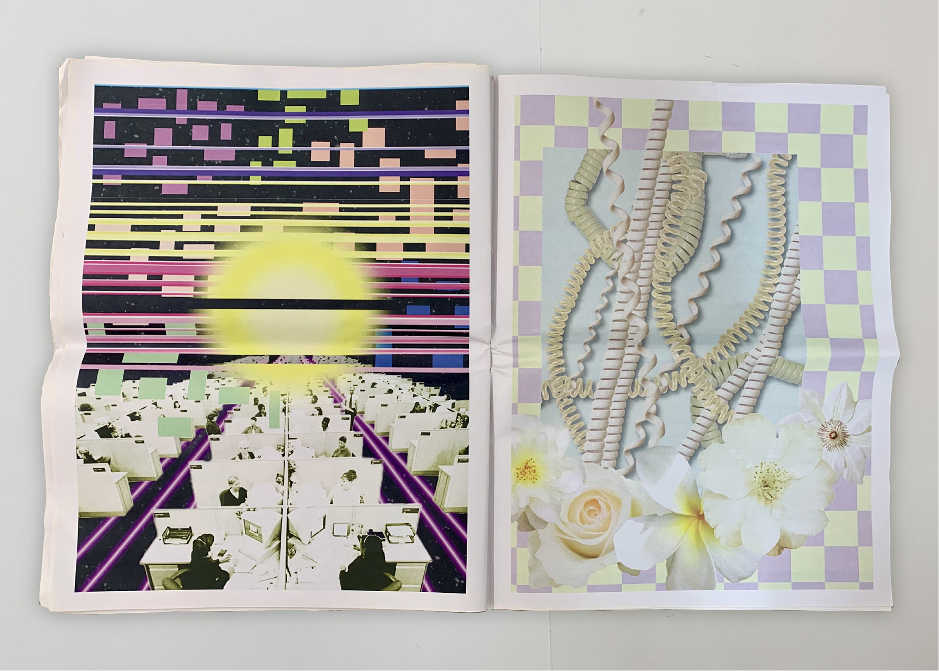
Vaporwave Newspaper Publication: Vaporwave is a genre of music that is largely a product of a connected digital age that has allowed for the accelerated collision of ideas, creating new forms of visual culture through the use of new digital tools.
For this project, I translated the core ideas of vaporwave and created a unique and distinct visual language that behaved in the same or similar manner. The objective was to understand the system that constructs the visual language of Vaporwave and expand upon that system with visual matter that aligned with my visual interests.
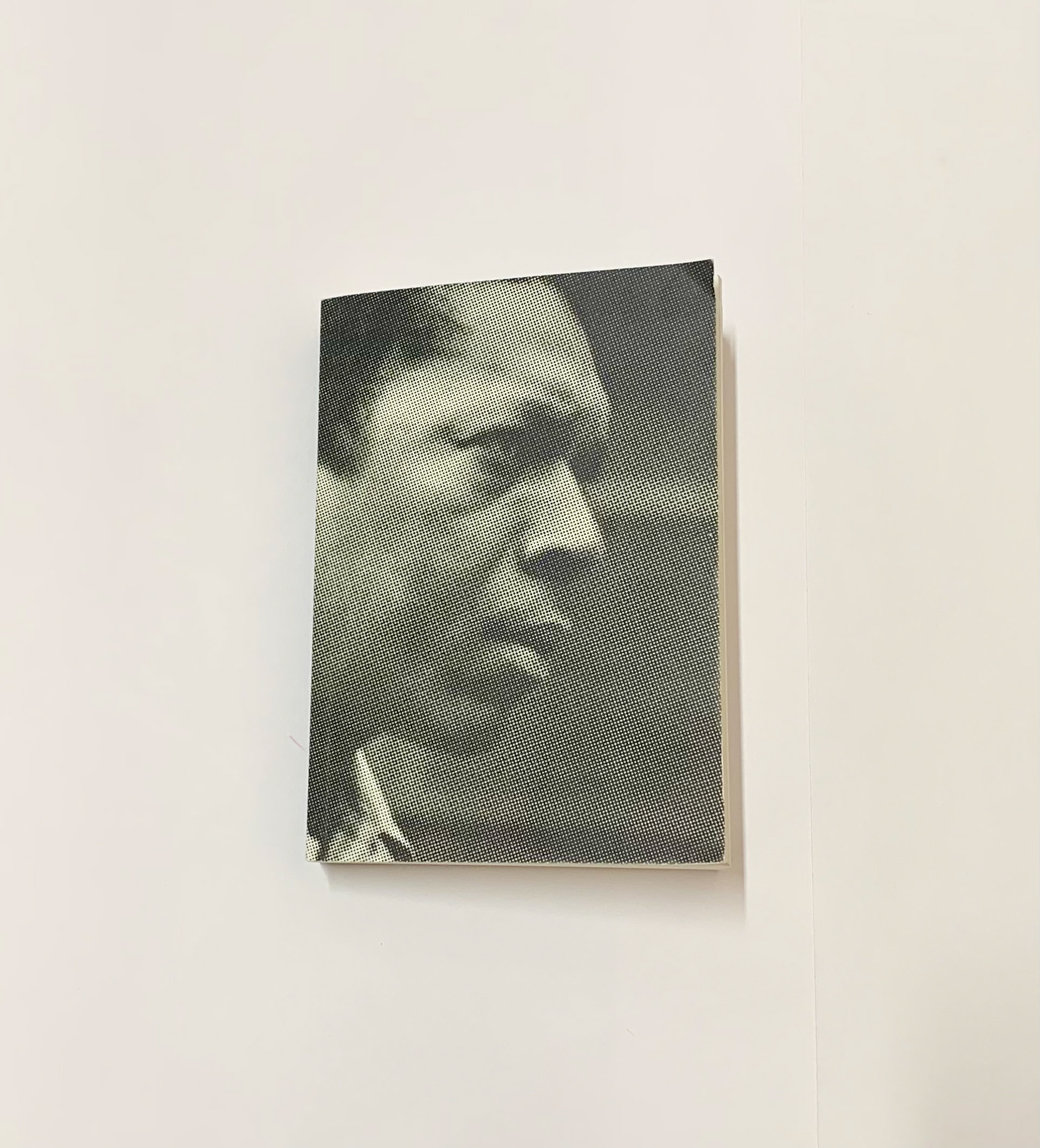
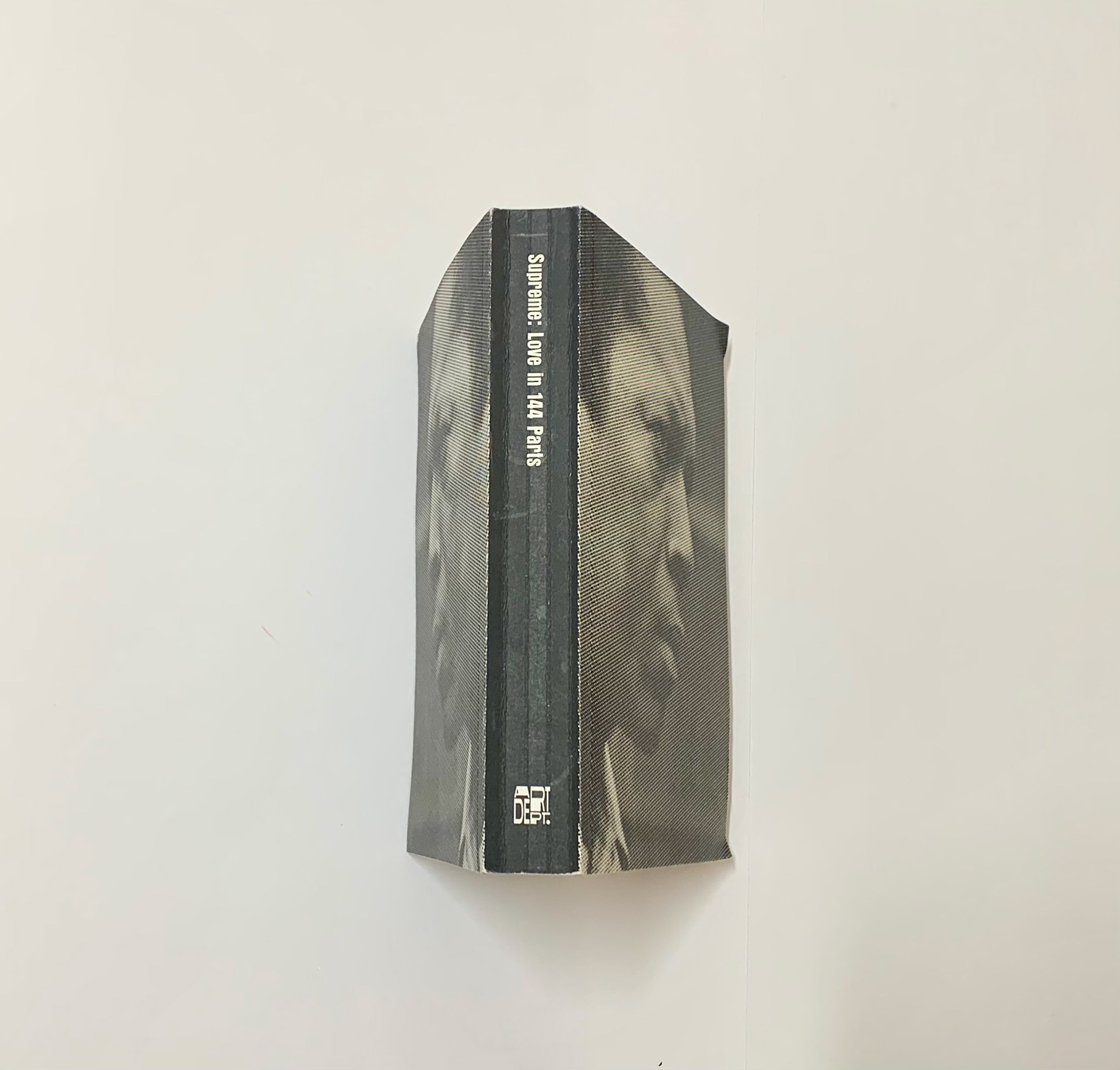
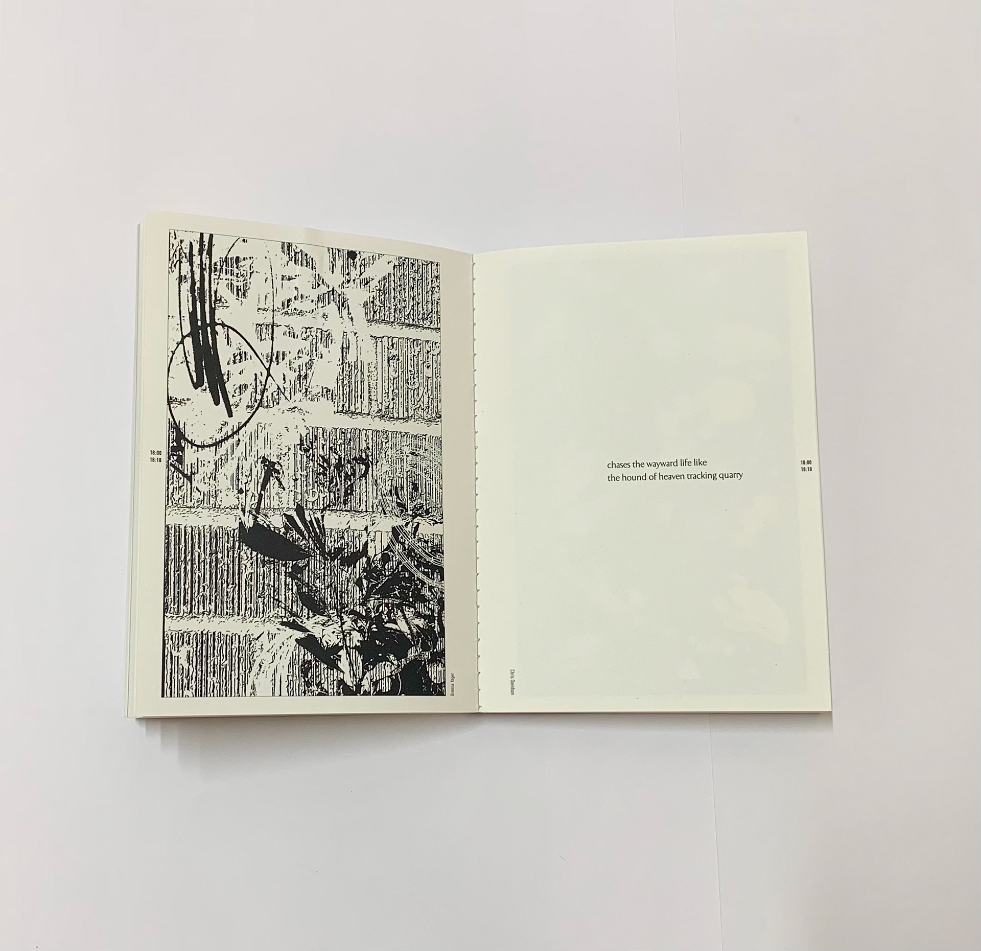
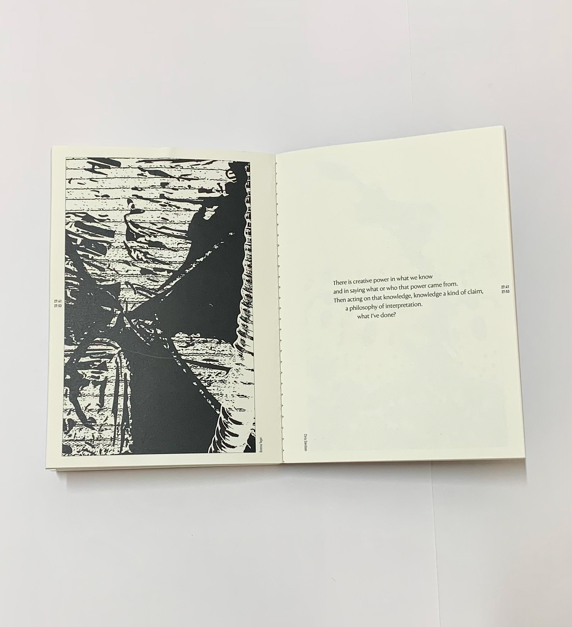
A Love Supreme: John Coltrane's A Love Supreme is a seminal album in the jazz canon, motivated by Coltrane's relationship with God. The album has been described as "an epic aural per to man's place in God's plan", and is divided into 4 movements - Acknowledgement, Resolution, Pursuance, and Psalm.
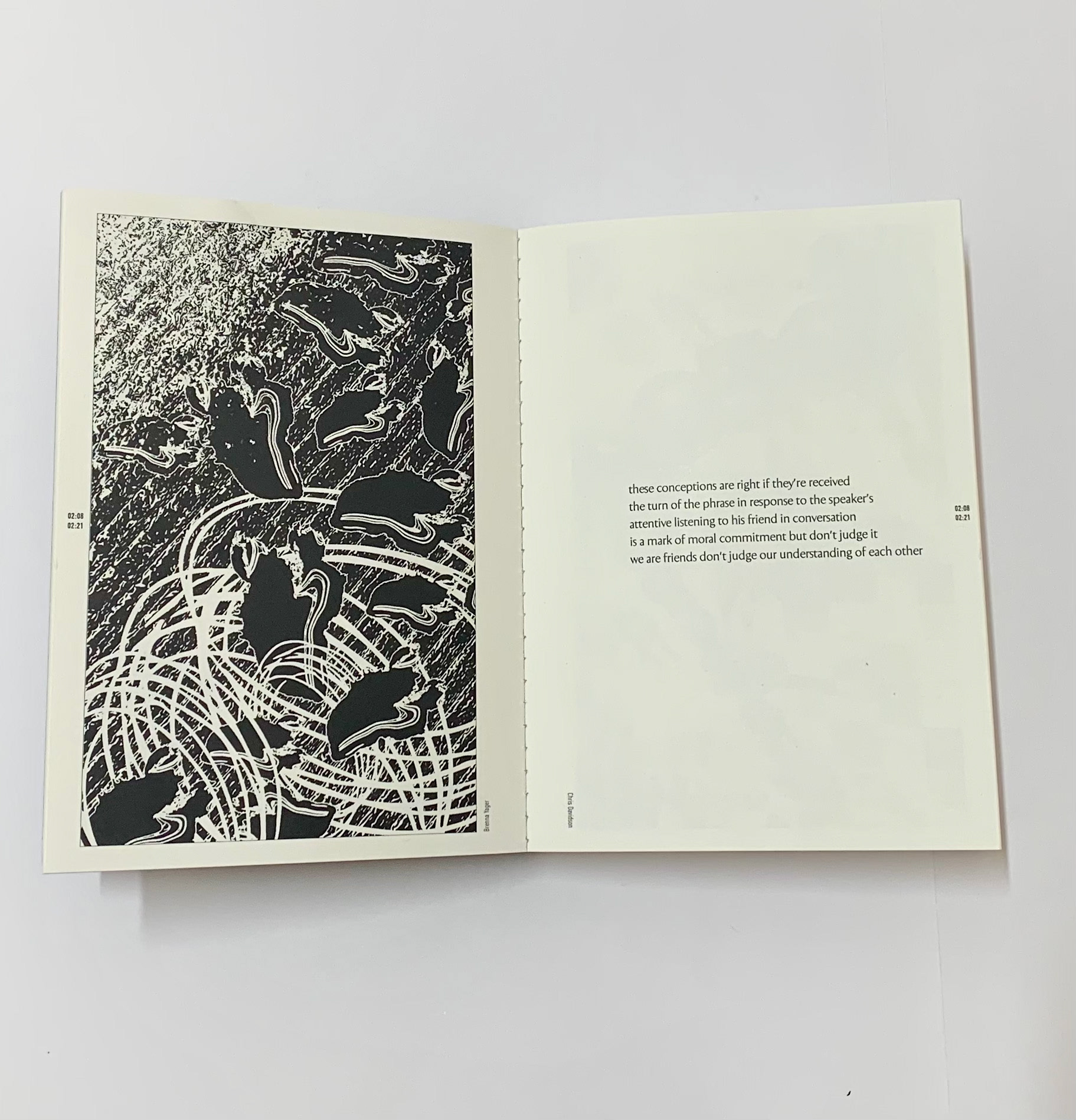
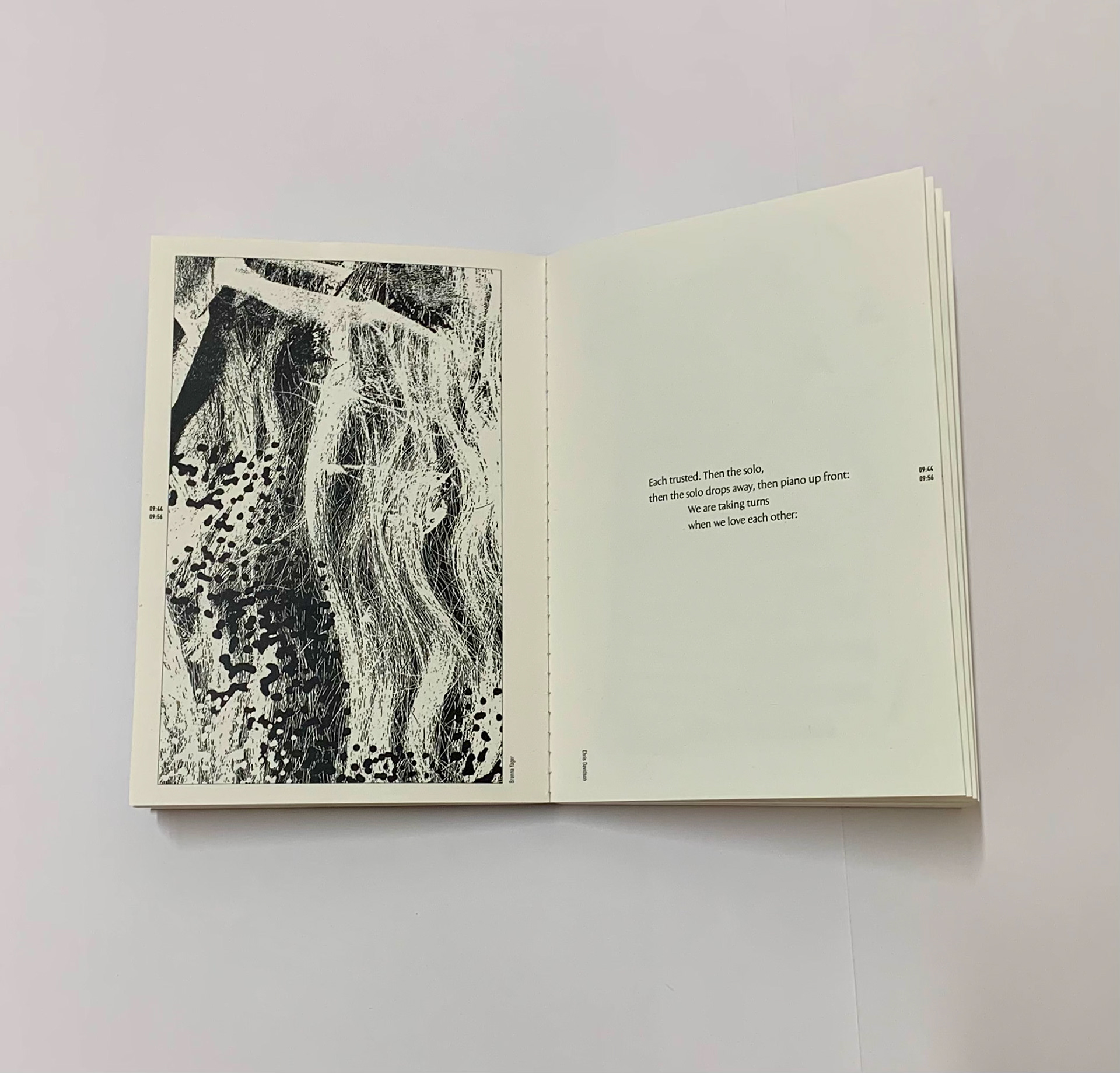
Out of this, I created visual translations of each of the 4 movements. Collaborating with other designers and poets, I was fortunate enough to be a part of the re-published and re-presenting the character and musical intent of Coltrane's A Love Supreme
(Listen Here: https://youtu.be/ll3CMgiUPuU)
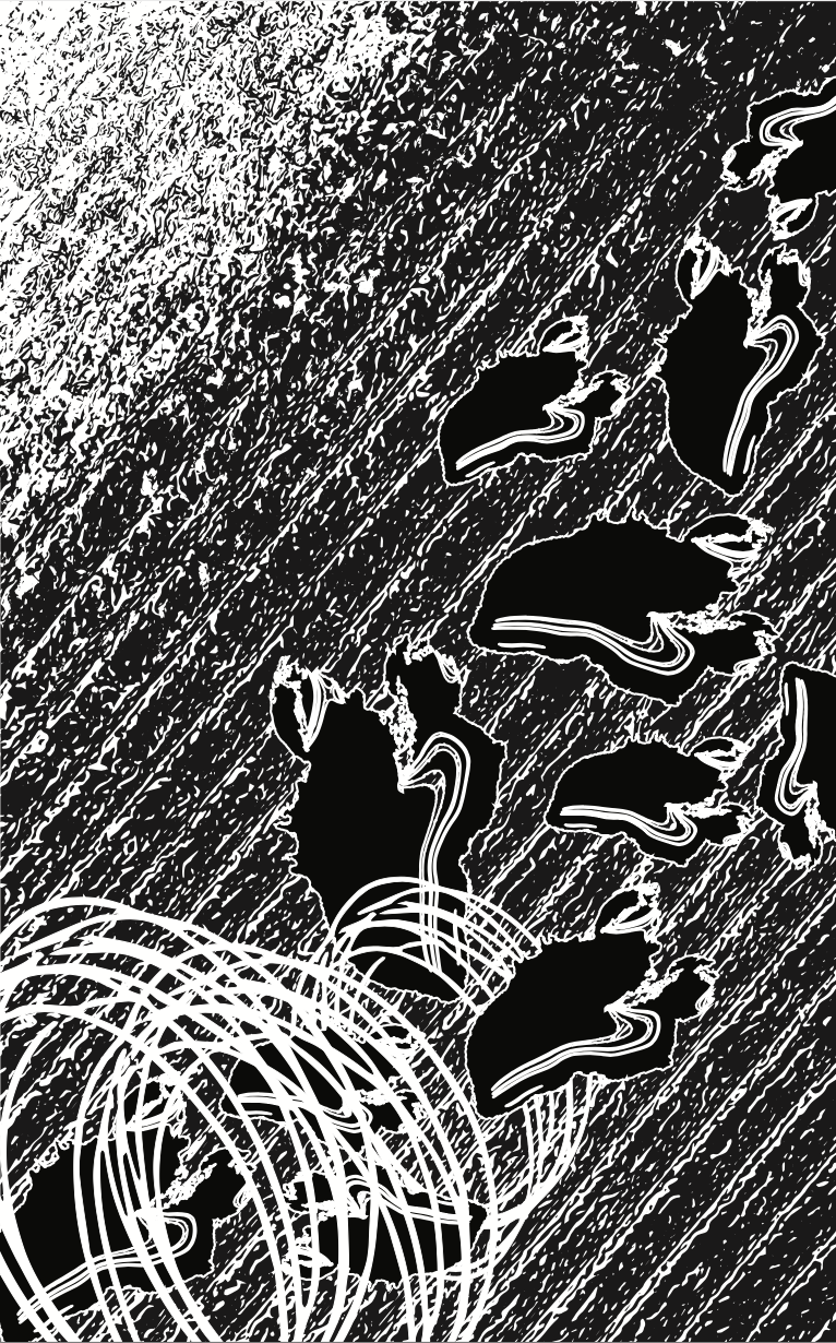
Movement 1: 2:08-2:21
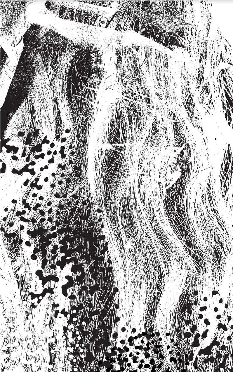
Movement 2: 9:44-9:56
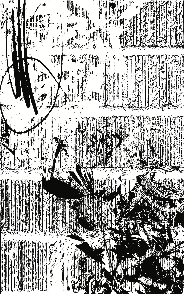
Movement 3: 18:00-18:18
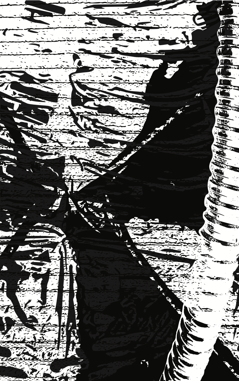
Movement 4: 27:41-27:53
